Feature Request: Keyboard available everywhere (esp. FX)
in General chat
Just copying this from the AB forum to not loose it.
As we still don't have more categories, I am just reposting.
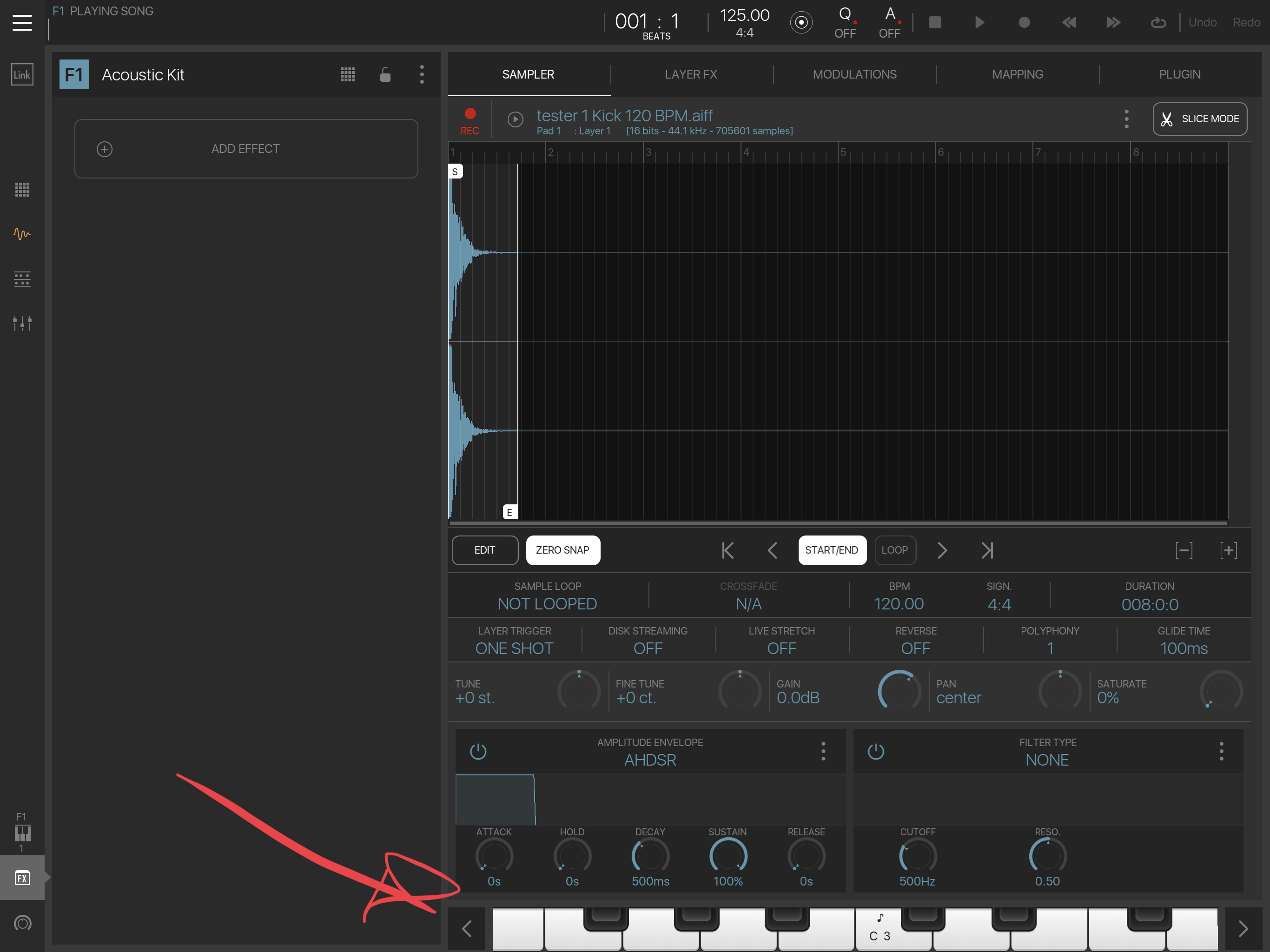
Please allow the onscreen keyboard to be usable everywhere, esp. for tuning FX.

Comments
Big +1. Onscreen Keys option in all areas of ns2 would be great.
BM3 actually has a nice keyboard for this
+1
Being able to bring up a keyboard wherever you are is a great help. I also miss it in the part editor, but if the vertical keyboard / pads on the left could sound notes, this wouldn’t be as critical.
I especially miss it in the timeline view. I get discombobulated (I love that word!) when I can’t see where I am in the piece when jamming in a part. A mini timeline might help with this, but isn’t my preference. I would prefer to be able to see the timeline and leverage its zoom and loop settings, solo/mute, etc. while playing, without having to resort to an external keyboard.
I’m trying to discipline myself to not obsess with tweaking FX and mix while focusing on the melody, but sometimes it’s just nice to be able to plonk in a few keys while adjusting things.
Yeah, if I've got a bass sound, I don't want to have to sequence a part on loop or whatever just to be able to add effects, etc to listen to something i'm in the process of creating. Sometimes the whole melody changes based on the effects I play around with. Having the keyboard available to noodle on would be a great help.
Would love to see this eventually as well. Wouldn't mind if it was modal and actually blocked areas of the UI when open. For instance the lower part of the mixer or the piano roll actions bar, etc. That is, instead of trying to work out a clever way to 'integrate' it into each UI without blocking, as long as it's quick to pull up and dismiss, block away.
^this. I don’t mind a slide-up or even floating window covering parts of the screen as long as it’s easy to get out of the way. Or, perhaps have the remaining app screen area scrollable so that the keyboard can remain, but the part of the window you need is still accessible. I think I prefer that, but some people might not.
Not a fan of floating windows...in fact that’s one of the reasons NS2 is my preferred DAW 😀
Full agreement. Just a quick show/hide keyboard button would be a huge overall workflow addition
A show/hide button to have a mini keyboard on the bottom of the screen would be very handy!
Nice idea but asking myself where to put such button On mixer screen, mixer detail, sequencer view, piano roll view .. when i’m looking at all those views .. where to put such button to have it more or less consistent with rest of UI ? Any ideas ?
Maybe if the instrument overview area was condensed slightly the keyboard button could fit on either side of it...to the right of the mixer button or to the left of the undo button.
But then instruments overview would be really small, specially on iPhone (which you need to have in mind for all ui components).. plus there is another request for displaying sequencer timeline preview on double tap over instruments overview - so it’s good idea to not make this area smaller than it is now...
Maybe change undo button to just one (eg remove “redo” which is still availabe on long press) and use that place for keyboard icon ? That would make sense to me.. keyboard would ten appear like standard rolldown window ..
Works for me, and pretty much any screen could be adjusted to fit that.
That bm3 sample edit page mini keyboard is better than nothing but using it for anything outside of simple mono note input bugs me. Would much rather the main bm3 keyboard was available globally in all bm3 pages/modes with a show/hide button.
If the keyboard pops up and is covering the controls for the plugin, how am I supposed to tweak and play at the same time?
Same as bm3 main keyboard should work ok? Doesn’t interfere with plugins
Ah yes! Forgot it worked that way, haven’t used BM3 in awhile
Some hosts make the plugin window scrollable if it can’t be scaled to fit the available space. I’m not sure how much I really like this, but it’s been OK when needed. (Example, Egoist in AudioBus 3)