Please give me a mini timeline
Great app - there, that’s out the way.
Please consider a long press on the track selector at the top changing to a mini timeline. A visual indication of where I am on the timeline while using the inbuilt keyboard is essential for my poor timing and playing skills lol

Comments
Agreed. Same when I’m on the pads drumming. It would help. I’ve been playing by ear for now until that time.
Trying to think of any problems there would be with a long press, but that could work. The instrument dropdown's invoked when the touch is released so that could be cancelled before it happens. Yep, like it.
@dendy @Blip Interactive
As I discussed this with you earlier @dendy and you was not sure what I meant, here is an example.
The mini timeline is important to myself for the sake of timing. Many people (especially the non great technical musicians among us) record by not only listening to the track, but seeing the track also. Visual indicators are very important for some people (especially myself in having memory timing problems due to my head pain illness).
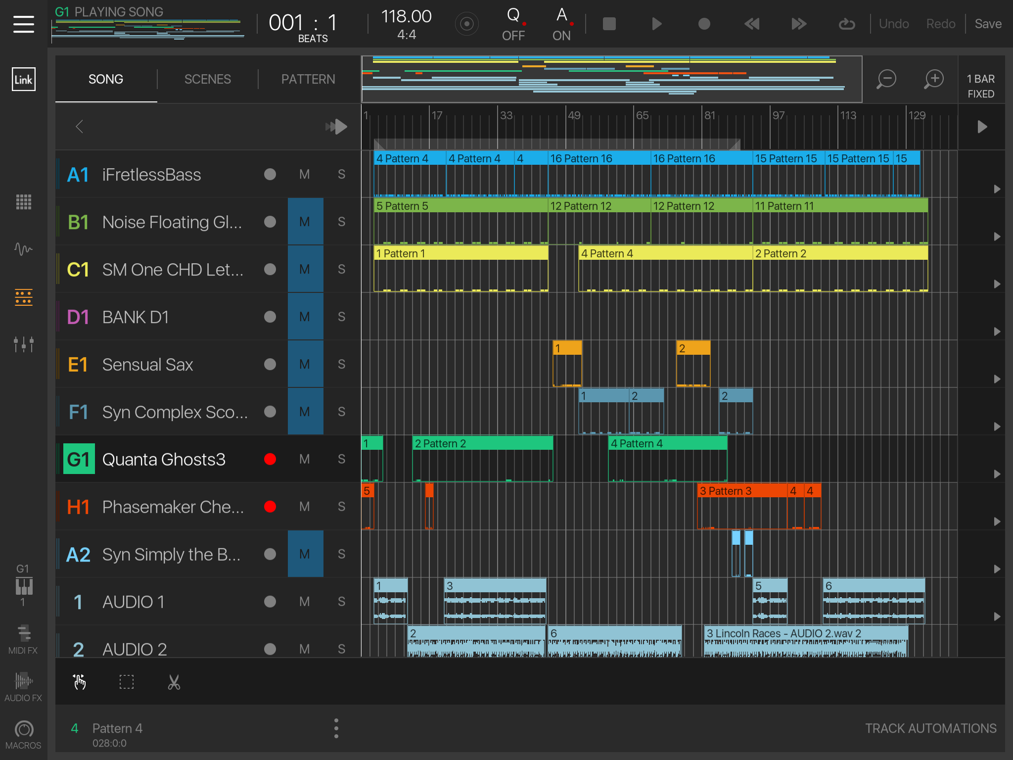
Below is a normal timeline:

All well and good. NS2 gives us the same clarity there.
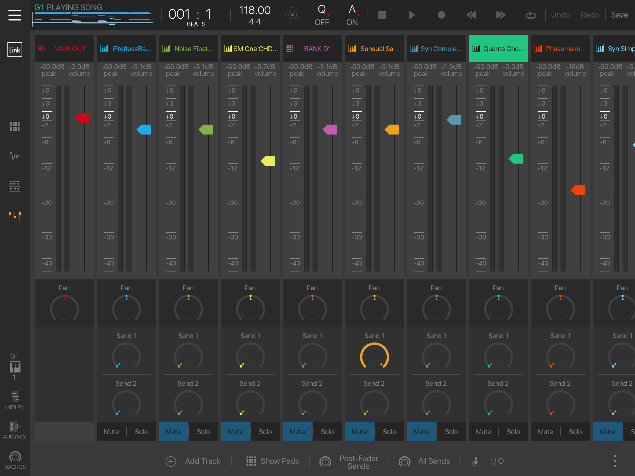
The problem comes when in other views such as the keyboard or mixer view, but pretty much any view really - that is of not having any visual indication or representation of what is on the timeline and where we are on that timeline.
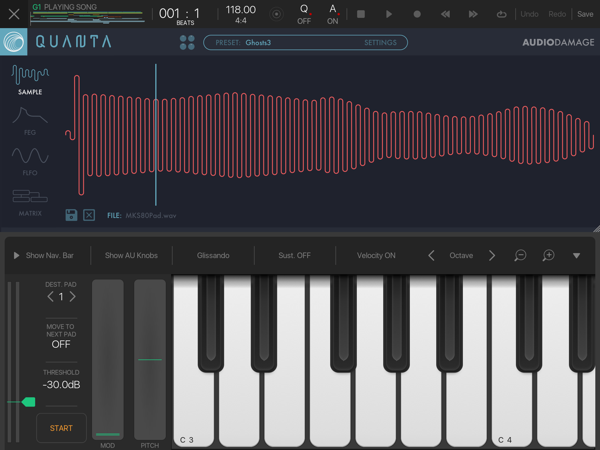
Here is an app that solves that problem:


See in the top left the mini representation of the timeline and a line runs across it to show the current record marker.
This is what I desperately need in NS2. I have suggested the position and how to use above in this thread.
Hope this helps explain my desire for this feature a bit more @dendy. For myself this is the biggest request I have - every other feature desire I can work around
Aaah now understand.. hm but this looks like pretty unique Intua idea, not sure if adding such thing to NS wouldn't trigger "stealing ideas" rage ... that would be bad...
oh what a complicated thing is nowadays software development, minefield ..
I don’t think it would. I tuna were not the first to have a mini timeline.
I can’t believe the stupid spell checker has changed Intua to I tuna lmao
any way it's good to be cautious.. we don't want trigger famewar beween comunutinies .. and it's also unfair to just copy something what was invented by other developer, at least in very similiar way ..
It would probably great help if you found 1-2 other DAWS using similiar concept .. from what i used on desktop (cubase, fruity loops, reaper), i don't remember something like that (althought it looks pretty handy to me, like it !)
epic
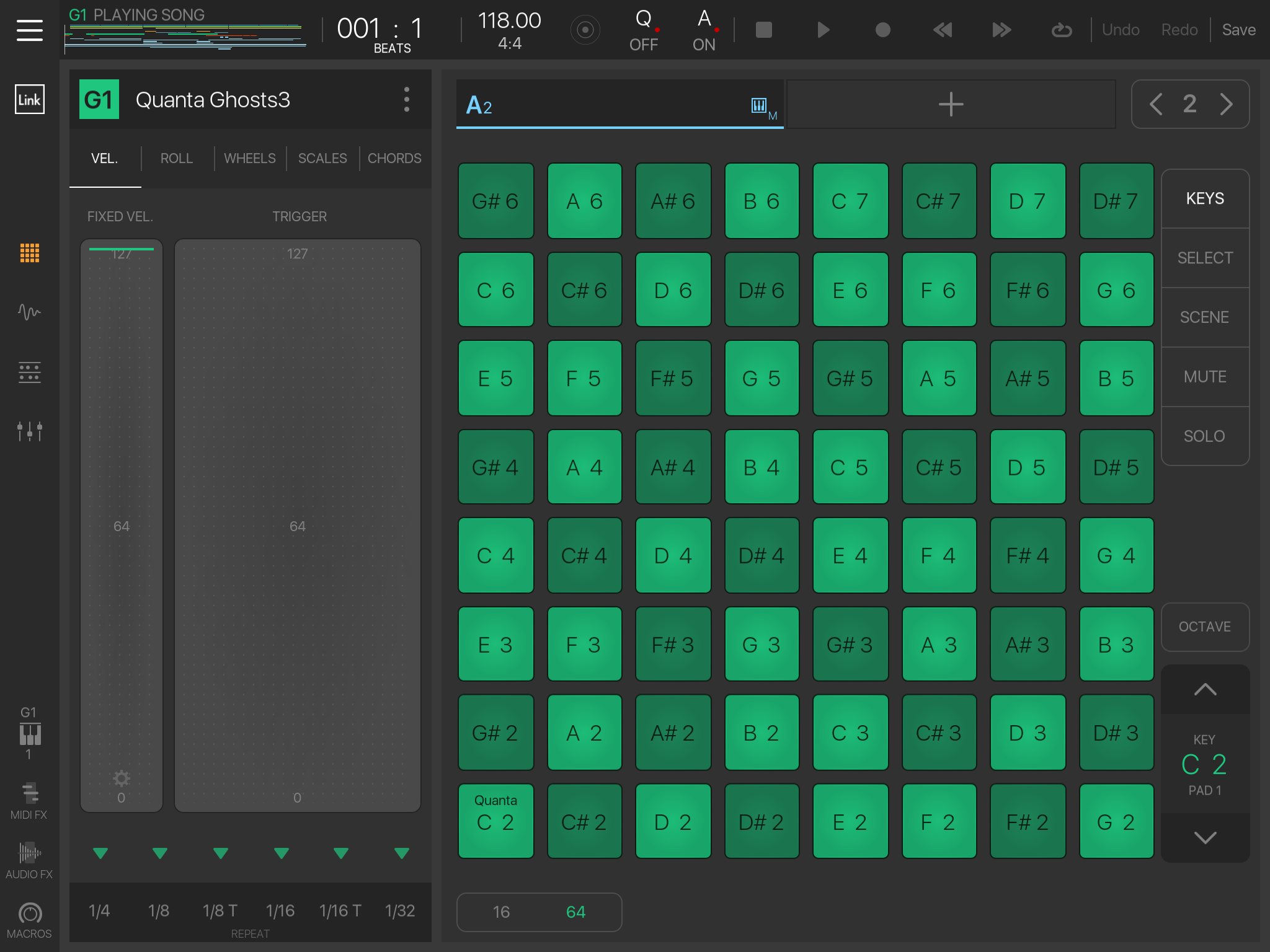
If people get on Matt for stealing Intua’s timeline, they also have to get after Intua for stealing Native Instruments’ live play mode, as seen in the last photo.
Everybody steals in app development. That’s what makes me laugh when people start fling accusations of “rip off!” whenever a new app is released.
What’s sauce for the goose is sauce for the gander.
I'm pretty sure we shouldn't go this way in this duscussion. Simply i feel it's wrong .. it leads nowhere .. But got the point.
Lot truth in this statement. It's hard to bring something completely new unforseen .. Everything already was invented
I will find you similar if not exact simply because some use other means. Cubasis can have a view with the keyboard and timeline. Auria Pro has a floating keyboard to put over any view.
Fact is nearly every app with a timeline has some feature so that you can see where you are on the timeline while entering notes - those that don’t are mostly designed to be more replications of hardware setups.
While I appreciate your opinion, it’s like saying we won’t put a magnifier to help poor sited people in our operating system because Apple will think we’ve ripped them off. And to be fair, I’m sure Intua know that NS2 is so different to there own product that to pick on that one feature is irrelevant
Don't get me wrong .. i'm not fighting agains this feature ! No way.. as i said i like it actually.. it would be nice to have it, definitely.
I just expressed my worries.. but maybe you are true, maybe it is no reason to be worried ..
Stick a faded picture of a blind man behind the timeline and all will be fine....actually don’t....that’s an appalling idea!
@dendy
Just remember....there’s a mince pie in it for you if it happens - bound to loads left after Xmas
I don’t think it would be “stealing”. It’s not a unique idea. I’ve seen it in video editing software. People ask for it for the video software I use now but I think it would be less useful there than it might be in an audio app.
Yep I’m trying to remember where I be seen it before. I know GM mobile has mini timelines at the top, but one for each track. But I’m sure I’ve seen it in many other types of software, just like video editing. It’s definitely not unique to BM3. Problem is I’ve used more software over the years than my brain can remember lol
Immix VideoCube. My first nonlinear editor! Upper right.
how about in nearly every desktop daw there is
@anickt
Great ! This is what i was searching for..
Ming boggling how after decades everybody still just repeats same UI patterns Ok i think now there is not even small reason to not add this nice thing into NS2, if maestro founds way and place where to put it .. .
I like that rectangle also, it's size may be proportional to zoom in sequencer view, last time it was opened (just my idea)
Yep. Everybody “steals” in development. It’s not the features in the app, it’s how they are arranged and implemented that really make the difference.
There’s nothing in NS2 that you can’t find in other apps. But moving around in the app and responsiveness are what make it uniquely appealing.
Yep little is new these days
Progress is generally accumulative in daw land. With each one usually just having an edge in certain area. Mostly it’s all crossover though.
StageLight has a mini timeline in Loopbuilder mode.
Yes it’s very handy addition. Would like to see it in NS2.
I knew I’d seen more around lol
Oh this is a super reasonable request! Put me down to the list +1 this would be so helpful!
I so suck at timing. As soon as red means recording I am so excited that i loose the timing all the time
Hey that’s me too!
Haha. I get all shaky and insecure in my melody and loose it all. That stupid “red light”
I get better when doing this with my guitar on a looper but I never lost it on the iPad
All the best music I’ve ever played has been lost to the air while not recording...then when I press record everything I do sucks!
I feel ya, bro