Selecting root notes for keyboard scales
I am a little puzzled about the whole design of keyboard scales in NS2, because nothing about it seems logical, which is weird in such a well-designed app.
I'm assuming that there is some kind of logic to the design and the UI, but for me it's really not user-friendly.
First of all, if you want to set your keyboard to display a custom scale you don't just choose a scale and set a root note, you have to transpose the scale from C. I'm sorry if this sounds snarky, but why do it this way? It means I have to count the semitones, rather than just set a note as the root. Also the terminology is wrong IMO, we're not really transposing, we're just playing in a different key. If you play in A flat that doesn't mean you've transposed from C, so just in terms of terminology this doesn't really make sense.
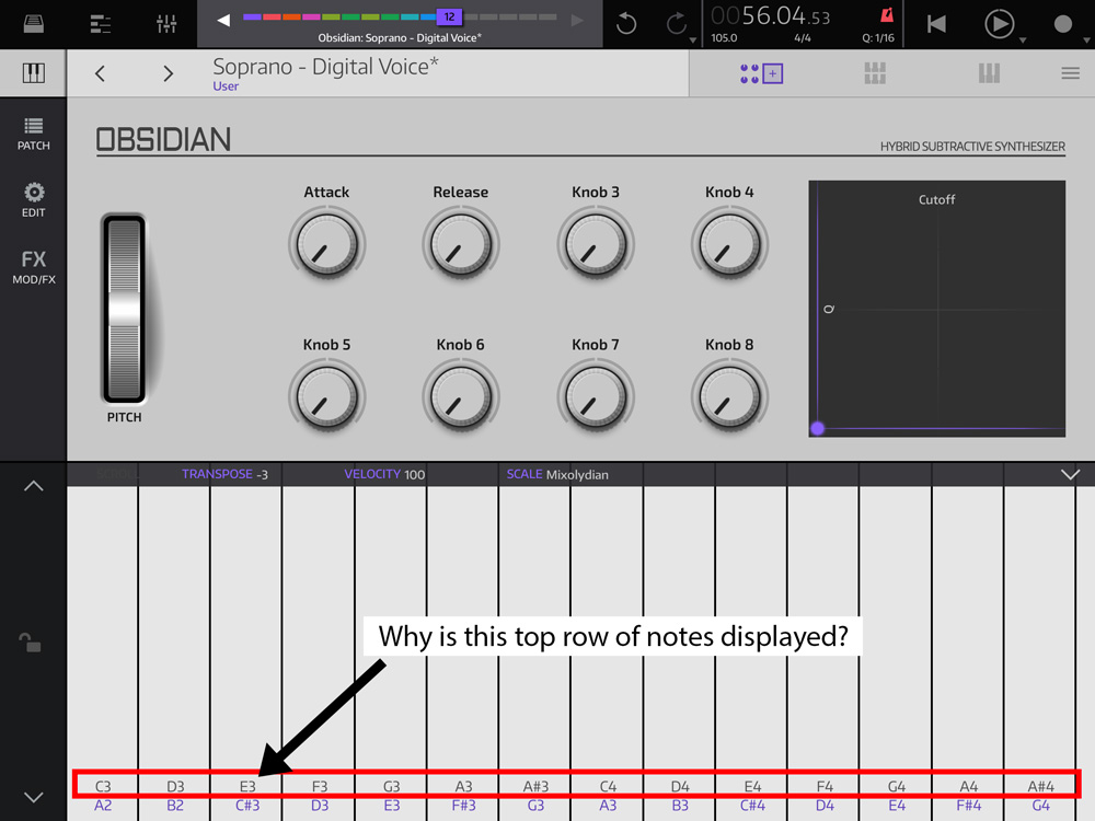
But more fundamentally, once you've set your keyboard scale, the keyboard displays two sets of notes, the top row shows the equivalent notes in C (and again, why?), and the bottom row show the actual notes in the scale. This is simply terrible design (sorry), because when I'm playing the keys my eyes are naturally drawn to the notes on the top row, simply because they are more visible when you're concentrating on a performance. This mean I often end up playing the wrong notes. I just can't understand this double display of notes, which is just really visually confusing and poor UI design.

So I know that NS2 is in most respects a really well-designed app, and that almost every feature would have been discussed and dissected in beta - but this aspect of the app really frustrates me. I just want to be able to pick a root note and not have to deal with all this extra baggage.

Comments
Doesn't bother me. But I agree it is odd design, and leads to puzzled new users.
Also, since all the keys are identically white no matter which scale you’re using, there’s no quick way to locate your root key. Most similar iOS keyboards will shade either your root key, or the sharps/flats, to give you visual cues of what you’re playing.
Yes, a darker shade for the root note would be welcome.
This has been requested a bunch of times, also by me. I don’t know what its status is, I don’t think it’s been mentioned lately. If there’s a lot of interest, I could use that to argue the point further. 👍
Now that I’m using the iPhone version more (I usually have the iPad connected to a MIDI keyboard), this has been getting more important to me (along with some way of displaying the keyboard in the effects view)
+1
This should be really easy, if i correctly understand whole thing i'ts just about removing top grey notes row and changing selection from ... -3 -2 -1 0 1 2 3... to "C C# D D#..." isn't it ?
Yes, exactly. And also highlighting the root note on the keys would be nice to have as well.