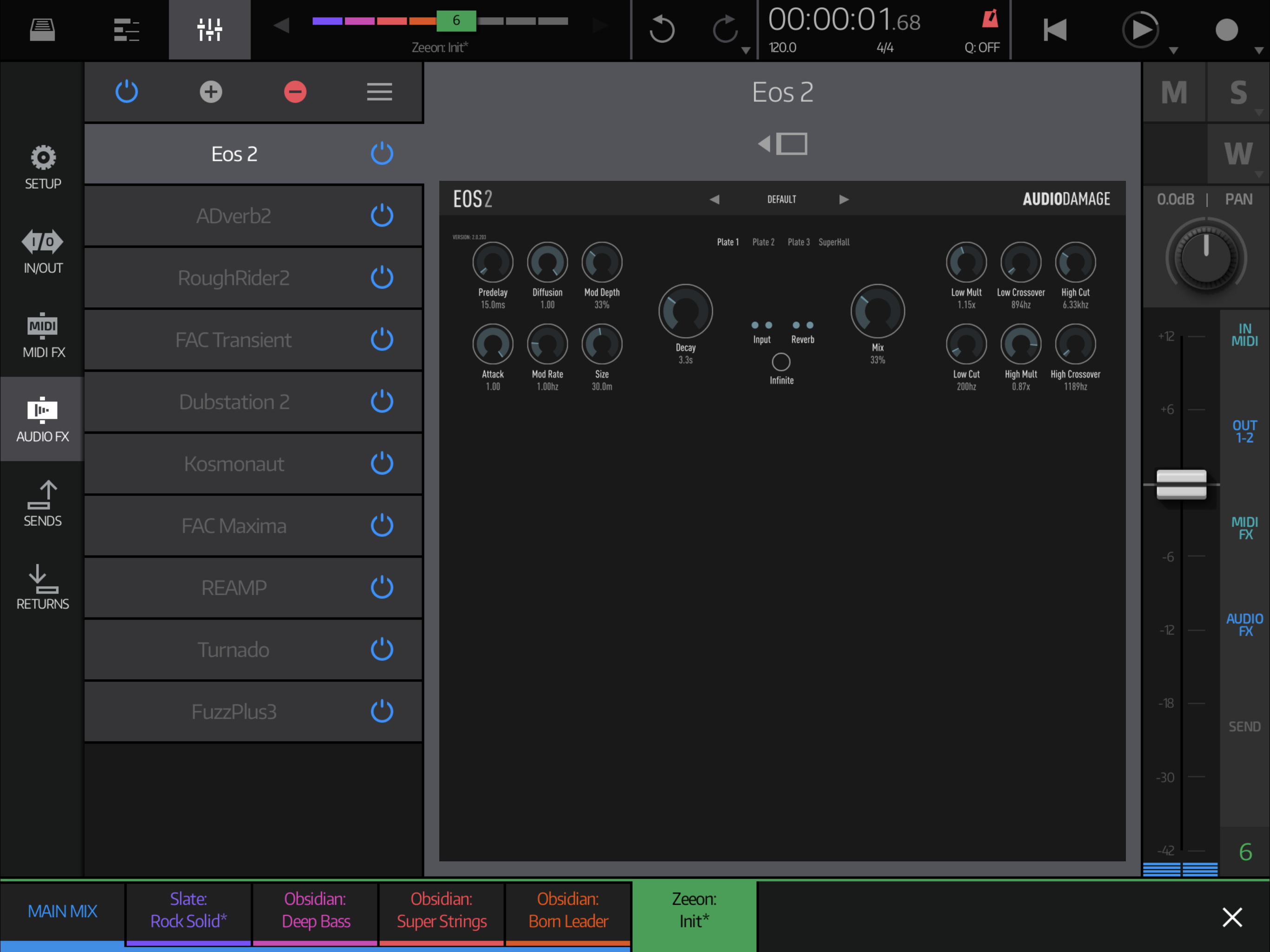
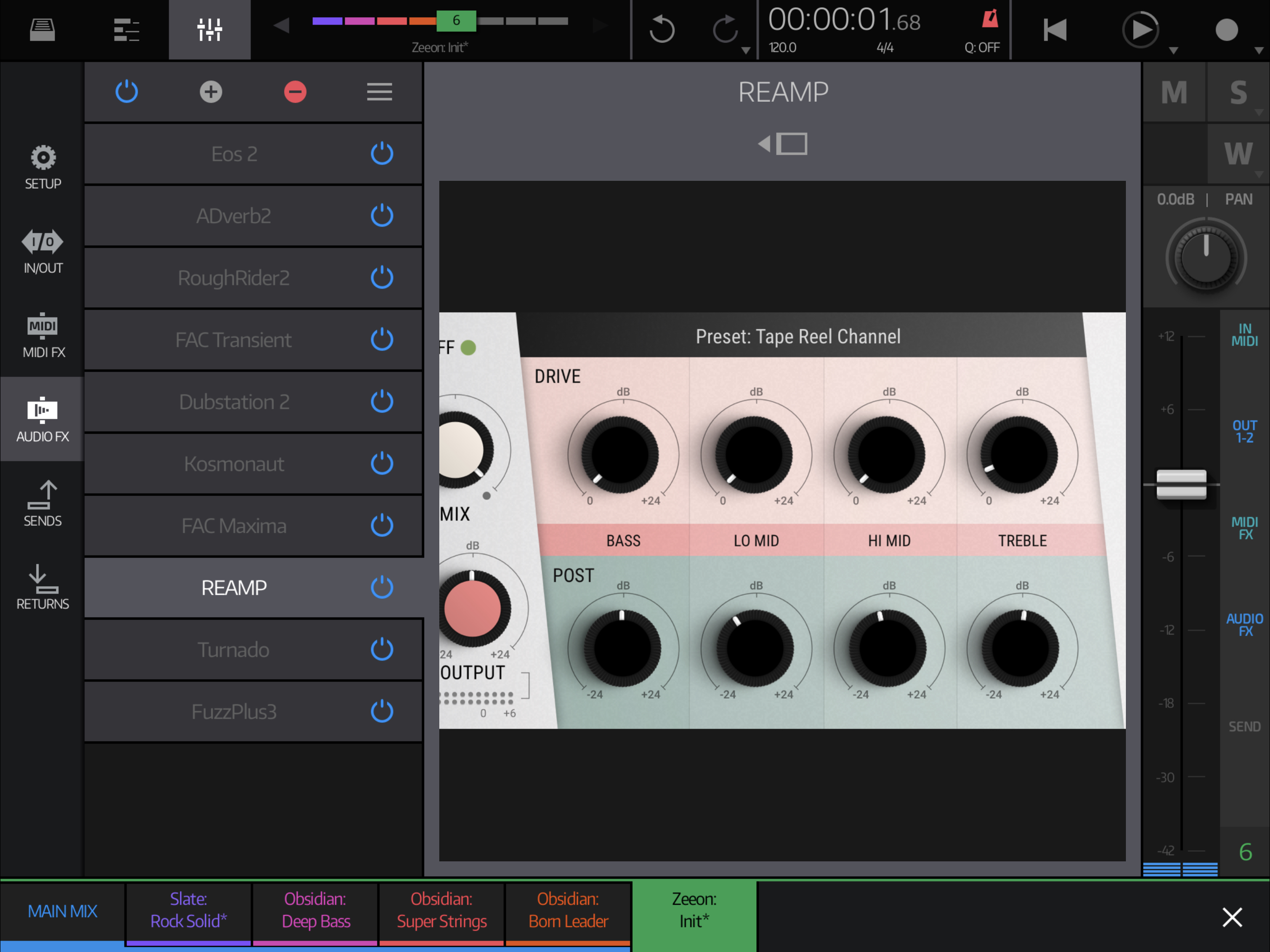
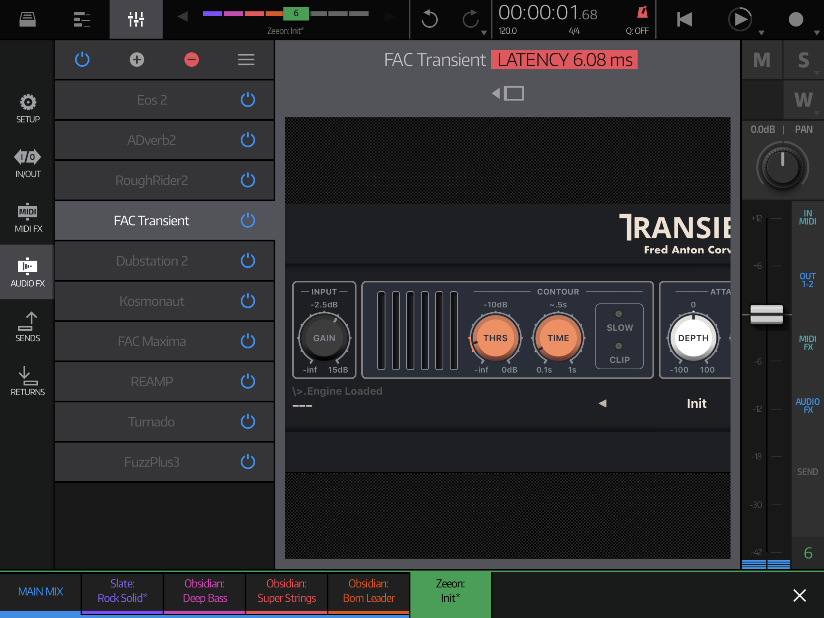
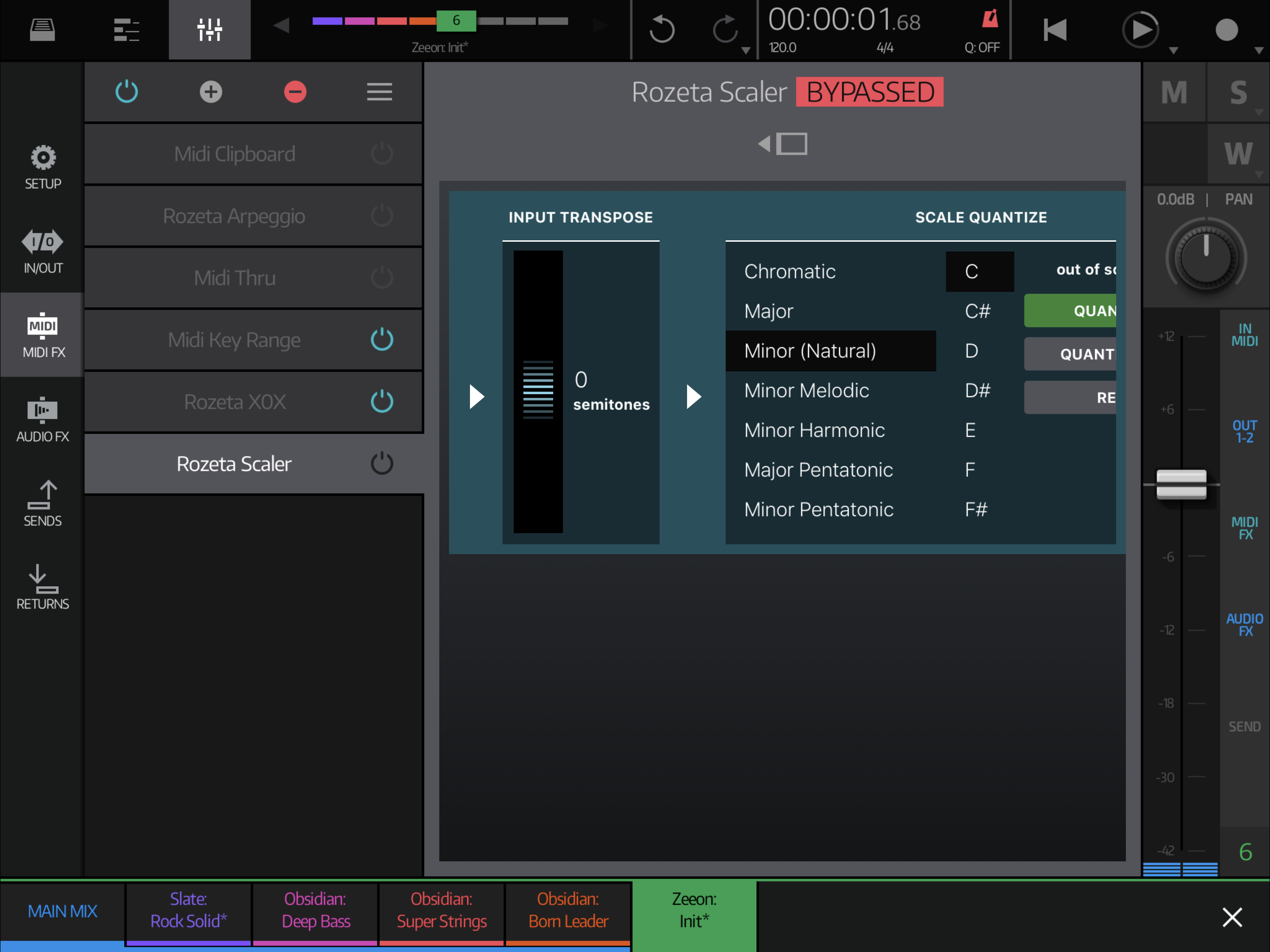
Most AUfx scale poorly in the default square format
This looks pretty terrible by default in most cases, and every AU scales differently. Considering that the rest of NS2 looks and behaves wonderfully, and AU instruments scale perfectly, this area definitely sticks out.
What's the reasoning behind this default sizing?
Any chance to better make use of wasted space by showing a keyboard or adding, maybe, some automation knobs?
Here's some screenshots.


Comments
Yes, I find this slightly cumbersome as well.
Some plugins conform to the space and others don't.
I like the suggestion of adding knobs in the empty space when relevant.
Ideally the regular aspect ratio would be used by default, in all situations. This means a ton of extra available real estate for knobs, keyboards and stuff.
As it stands right now, it's neither pretty nor functionally useful to have this square format.
I believe I see why this was done, so that you can easily go through the list of FX from top down, but agreed, AU's scaling woe's are everywhere. If the list was horizontal on the bottom half, that would fix a lot of the issues, but then THAT would be intuitive looking to me. Maybe Matt's hoping that people will start fixing their plugins
Experience with other iOS DAWs, each with their own scaling oddities and custom AU sizing, teaches us that most AU developers are highly unlikely to ever update their plugins for unorthodox formats. BM3 has suffered (and still suffers) from this greatly on the 12.9" iPads.
My guess is it’s the AU’s and not NS2. The 4Pockets effects all scale properly in both views. The view you are showing, I believe, is not the “working” view anyway from what I see.
I'm talking about defaults. I understand that I'm able to go "full screen" (somewhat full screen) and get functionality back.
As it stands, the Audio / Midi FX strips are ugly, AU UI is inconsistent, and everything wastes valuable screen estate in the default view.
Of course AU developers can update their code to support yet another aspect ratio more gracefully. I'm willing to bet anything that they won't.
The other problem is the lack of any on screen keyboard or note button on this screen. When not using any connected midi keys, it makes life easier to be able to play a key while adjusting settings to at least get the fx in the ball park before recording.
+1
This. AU is jungle full of shitty code. Poorly optimised, unstable, not reliable..
And the fact how poorly Apple documented AU API doesn't help clean situation.
If you see, lot of plugins looks great in all views (like Bram Bos plugins, which are great example how AU plugins should be done. Also
Ice Gear did outstanding job with UI)
If something is wrong with plugin UI, it's fault of plugin developer, improper or better sloppy implementation and he is responsible
to clean own shit
Um, yeh maybe, but just how many AU apps have a square layout like that window? It’s just not a great design decision. Also, that attitude is inconsistent with the “if you’re going to do something, do it well” mindset of NS2. If other app developers can make it work, then Blip can do it better.
Time to get off the high horse just a little.
That layout fits perfectly for built-in effects.. AUs entered game lot later than this part of app was finished..
Honestly to rework this whole screen which fits perfectly to rest of app and for built-in effects just because of sloppy AUs would be .. not wise :-)) Of course thats just my personal opinion...
Btw wondering how much you Just give a
people are abusing AUs
try to build in effects - they are awesome, not like built-in effects in other iOS daws, far above average
I use in my project at 99% just built-in effects And they are super efficient, you can run lot more of them than AUs
Get out of your comfort zone and try something new
Getting AUs to size satisfactorily has been frustrating and I'm not happy with it either. Plugins are meant to give the host information about the screen sizes they support. Some of them do, some of them don't. The ones which don't spoil it for the ones which do, as it means I can't trust what they're telling me and just have to force them to a minimized size (which some of them handle nicely) or full screen (which is the only way I can ensure that every plugin will work).
One possible solution would be to create a whitelist of plugins which report their desired size properly, but that would mean the host's hardcoding around specific plugin behaviour which feels wrong.
Open to suggestions about how the effects page could be changed to fit peoples' requirements.
@Blip Interactive
Well, AUM and Ape Matrix handle AU’s nicely with floating and resizable windows. Maybe that’s against your philosophy of UI design, but it seems to me every host that tries to force AUs into specific areas of the screen runs into problems like this. Besides, it makes it possible to have more than one AU on the screen at a time, which can be very, very useful.
But ... I get it if you’re not open to that approach.
Use the standard size by default. Fill up the wasted space with knobs (macros maybe, for automation!), and a keyboard. Allow going full screen as opt-in.
I don't think there is one single AU which was designed for a square format on iOS. I don't think it's the AU developers's fault for not anticipating a new DAW with a new square format. Making AUs scale to any possible size requires time and money.
Like this idea ! Except of keyboard, don't see any usage of keyboyard for audio FXs... this will
solve elegantly also problem of automation and both instruments and fxs will work same way
Really good idea !!
Screen keyboards are useful for tweaking effect parameters while messing around live, before recording anything. It's the same reason why you'd want a keyboard while tweaking synth parameters.
I’m sorry not trying to argue with you but I think that was poorly answered. You’re asking people who have bought multiple AUs before NS2 came out and are already used to them in their workflow to stop using them in favor of the ones in NS2? Come on man, that’s ridiculous. If you use the NS2 built in effects in you projects and enjoy them that’s great for you. You have to remember not everyone was on the beta team and tested these for years. You’ve got used to this workflow so that’s your comfort zone not ours and maybe you should be a little more open minded to other apps out there.
That square screen was the first thing I questioned on the AB forum. I’m glad to see that the developer is open to suggestions and willing to work with us on this. Thank you Matt.
@hansjbs
you are true, i was wrong. sorry.
I love my au synths and fx. But, one thing I don’t like is all this “floating about” on the screen in other apps. I love the look of the screen layout in NS2. I’m sure Matt will come up with something - in time. Hardly an emergency scenario.
I also don’t like to argue but I want to mention that NS2 is the only AU host I know with these problems. 😎
Well, it's the only one with such a jarring square format for displaying AUs.
But if you resize windows in AUM for example, you'd get similar issues. But AUM doesn't use this square format as the default. Neither does Cubasis, BM3, Garageband or any other DAW.
I was not saying you are wrong. Just saying it was poorly answered. I respect your opinions.
Also saying that AUM does that quite well and that NS2 should adopt.
As always, maybe only over a toggle in the setup, to not break things for people who like it as it is.
I can live with the resized image for most of the AU fx apps, but it takes too long to get there!
If each track remembered the last fx opened and kept it open, that would help. Then we need some way of triggering a key so that you can test the fx when not using a midi keyboard.
Because devs of those hosts are simply doing hard coded per-plugin fixes and workaround just to keep users quiet and satisfied. Which is completely wrong in long term because this is direct way to instabilities, another bugs and still more and more hard to maintain code.
They are simply doing dirty work which should in first place do plugin developer, to make his plugin working properly in in all hosts without forcing hosts developers to mess their own code with tonds of such fixes and workarounds.
That's why.
This is extremely unlikely to be true. From what I can tell, other DAWs just use a single size for all plugins, there's no special casing for individual plugins. It's 1024x335 points. Which is the size in Garageband, so no surprise there.
+1
Yes, I do not think this is accurate. AUM has had relatively few updates and I can’t recall a single instance where plugin sizing was an issue (memory could fail me however). I’m less sure about ApeMatrix, though I also don’t recall any. And Apple? Modifying GarageBand to accommodate ill behaved AU plugins? Hahahaha!
