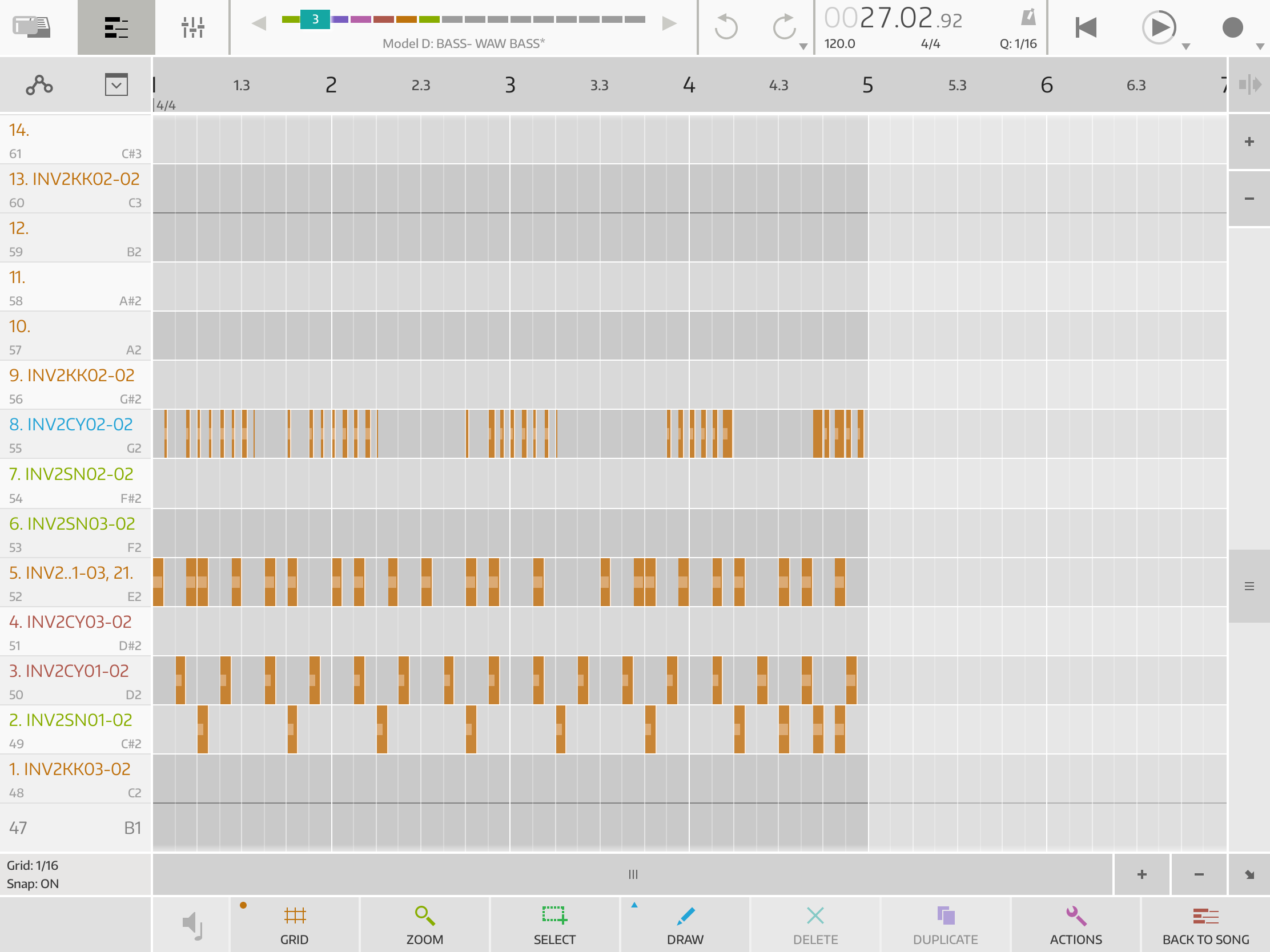
Light mode?
I can't see the note spacings (gridlines) in the sunshine. Laying on the sunbed it's really really hard to see.
Only that part is troubling me.
I can't see the note spacings (gridlines) in the sunshine. Laying on the sunbed it's really really hard to see.
Only that part is troubling me.
Comments
Yes, this is still an issue. We did get an improvement on the initial look though, that was even darker. I suggest making the grid as wide as you can, so snapping is more obvious.
And on a lighter note, Ableton just fixed the same issue with Live 11. That only took 3 years and cost around 150€ to upgrade 😀
"on a lighter note..."
Thanks for the information. Its not often i sit in the sunshine with ipad so it's no big problem.
I just thought of a small thing that solves the issue.
Invert colors in the ios settings, u have smart and classic, i dont see much if any difference between them but the result is amazing.
I just wanted add screenshot but the screenshot is not inverted . So test for yourself.
Edited screenshot so now you see the difference.

That’s a great solution. You can also assign invert to triple-click home button if you have a home button.
Smart is only different to classic in that it might leave photos uninverted in some apps in some contexts. 90% exactly the same.
Thanks for explaining.
I do have a button, And found the setting. Its great thanks.
Its located at accessibility -> accessibility shortcuts.